DePaul University, School of Design - Digital Marketing Brand Book
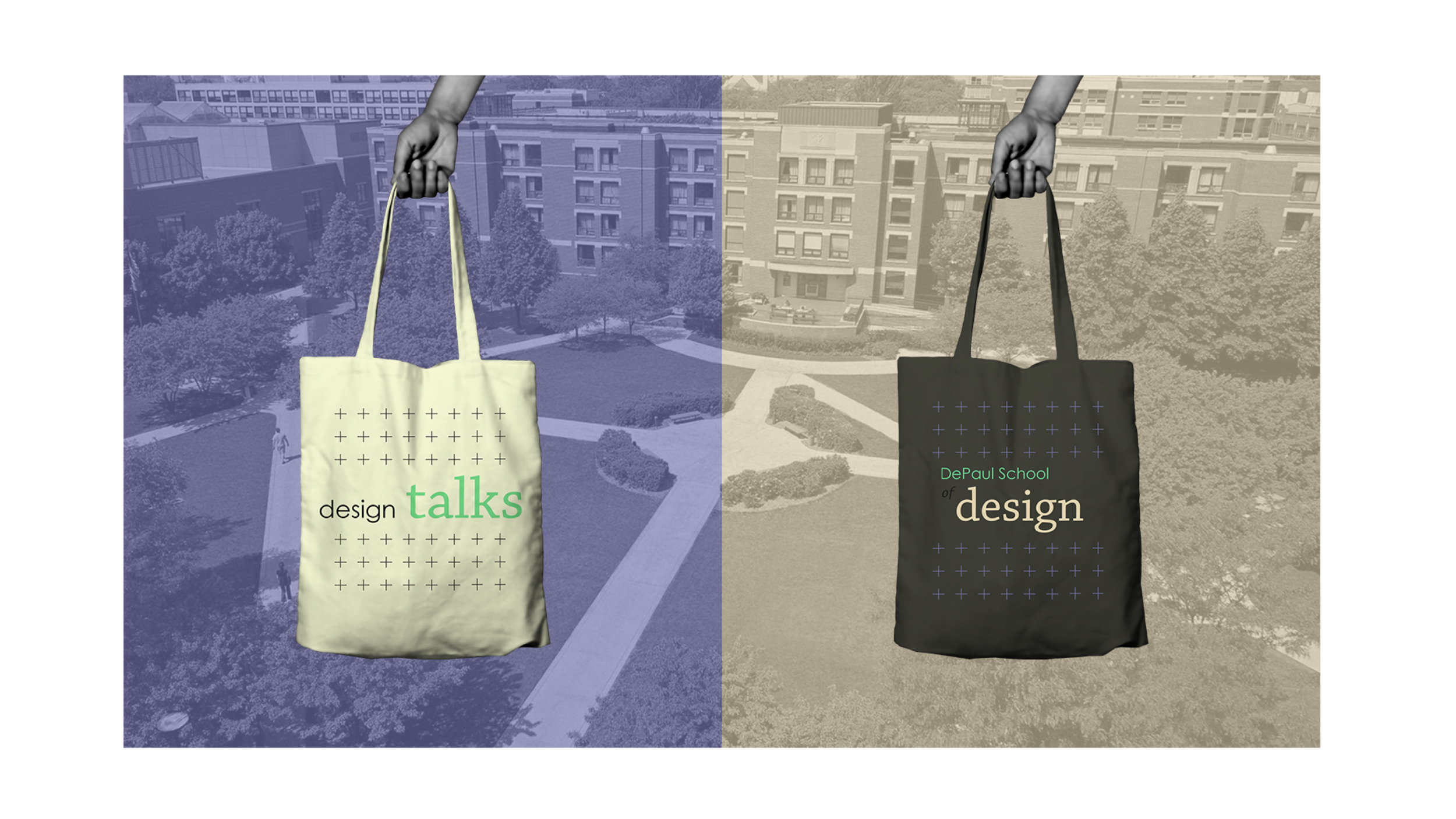
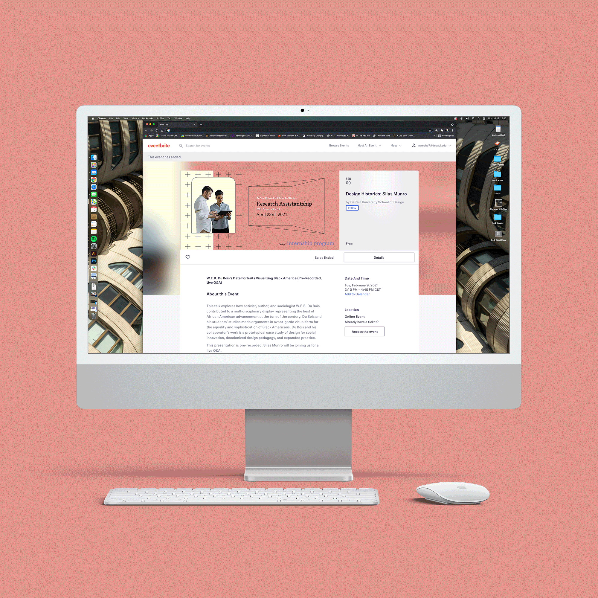
2021 During my second year at DePaul University’s School of Design, I worked as a graduate assistant. Our team’s main objective was a departmental rebrand for the program’s digital events marketing strategy.
Objectives
(1) Evaluating and updating marketing strategy by consolidating our promotional channels.
(2) Creating a unified voice for our programming.
(3) Devising consistent wordmarks for our brand’s four entities
(4) authoring iterative event templates for implementation by future generations of the program.
Team
Andrew Stephens - Design Lead and Implementation
Janet Hill - Research and Application
Supervision - School of Design Faculty
Challenges
Wordmark - strict limitations and parameters set forth in university guidelines
Social Reach - Determining which platforms and touch points were most effective for promotional efforts. Essentially, figuring out where and when to place content in order to maximize our return in drawing students and faculty for events.
Consolidating Department Efforts - Taking multiple program initiatives that were operating across a variety of digital, social and legacy channels in order to communicated effectively TOGETHER. This meant LOTs of meetings to align our efforts into a unified vision. Ultimately, we arrived at a collection of assets, font families and a vibrant color palette to pull everything together.
Designing for Dynamic Digital Environments - The web is still sussing out its own consistency issues. There’s no one size, resolution, or aspect ratio that fits all. Over the course of this year long project, a couple of our digital platforms changed banner and icons sizes without notifying their users–this meant staying our toes to make sure our products stayed presentable. At the end of the day, our team focused on creating atomic templates that could quickly be tweaked to fit fluctuating environments.
Please contact me for more information on this project–There’s a complete brand book, application breakdown presentation and the template files. I would be happy to speak more to those upon request.
Digital and Physical Implementation

Color and Font Families

Type Specimen and Wordmarks


Assets


Digital and Social

Template and Workflow Break Down
Design Research Videos COMING SOON!!!
Check back late August 2021
INTERPOSE Records - Web and Print Events Marketing Graphics
January 2020 The purpose of this project is to showcase consistent layout, imagery and typography for the marketing materials of a record shop’s promotion of products and performances performances.
For a complete look at layout styling please view the PDF below.


Social media specific designs
maximize your space.

Handbills
that resonate rather than explain.

Posters
bring the experience home.

Product photography
to accurately inform consumers.

The Toal Package
Includes full color renders and templates.

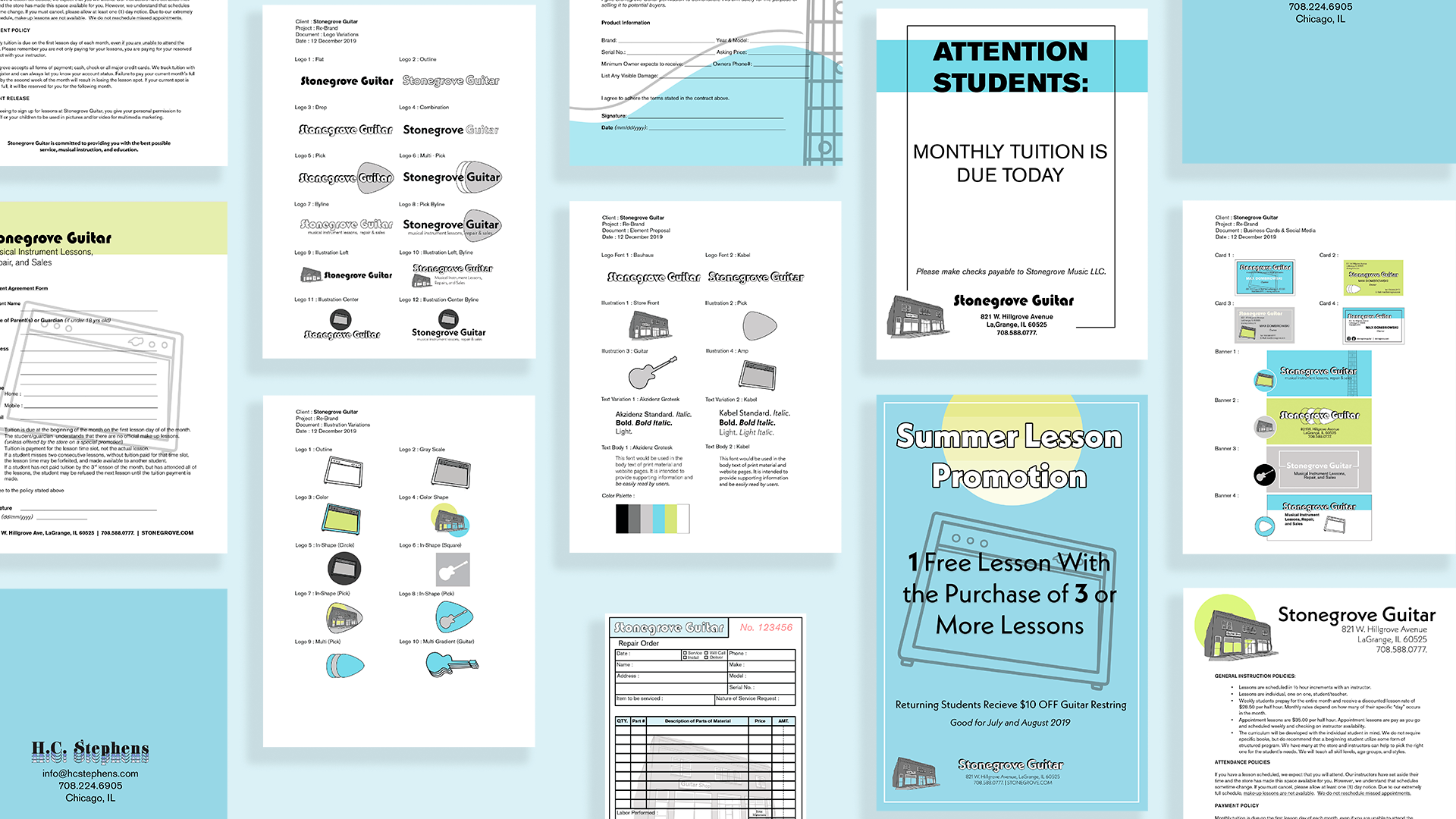
Stonegrove Guitar - Style Guide
DECEMBER 2019 The images contained within this package display a comprehensive brand re-working for Stonegrove Music LLC., a retailer that that sells stringed instruments, music related products, offers personalized lessons and performs technical guitar modifications and repairs. This package moves from fundamental brand imagery through full implementation to form a complete identity.